Why faceted?
At first glance it might seem we are re-inventing the wheel here. If you just google for “matplotlib subplots with shared colorbar” you’ll find a StackOverflow question with numerous answers with varying levels of complexity (some in fact are quite elegant). It might be tempting to go with one of these solutions, e.g.
In [1]: import xarray as xr
In [2]: import matplotlib.pyplot as plt
In [3]: ds = xr.tutorial.load_dataset('air_temperature').isel(time=slice(0, 3))
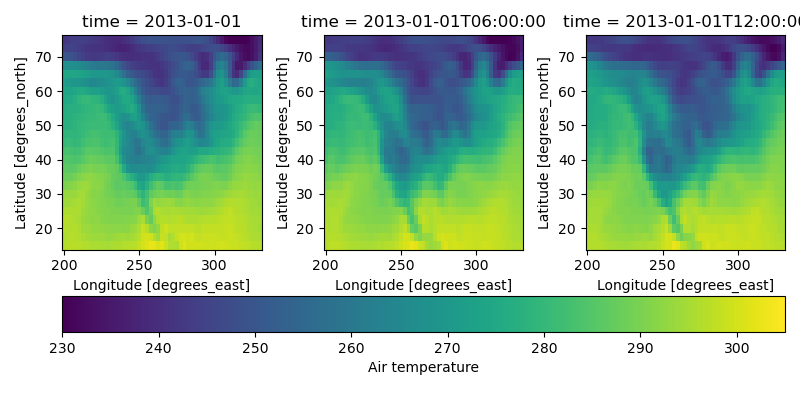
In [4]: fig, axes = plt.subplots(1, 3, figsize=(8, 4))
In [5]: for i, ax in enumerate(axes):
...: c = ds.air.isel(time=i).plot.pcolormesh(
...: ax=ax, add_colorbar=False, vmin=230, vmax=305)
...:
In [6]: plt.tight_layout()
In [7]: fig.colorbar(c, ax=axes.ravel().tolist(), orientation='horizontal',
...: label='Air temperature');
...:
This looks ok, but things become a bit more challenging when we’d like to
have a more control over the spacing and size of elements in the figure.
matplotlib is super-flexible in that it is indeed possible to do this,
but if your starting point for creating paneled figures is
matplotlib.pyplot.subplots(), which it so often is for many of us,
your options for exerting this type of control are somewhat tricky to use.
Let’s take the example above and start to impose some contraints:
Tight layout does a decent job of finding the right between-panel padding based on the axes labels, but I’d rather have direct control over this. Let’s impose a horizontal padding of half an inch between panels.
The colorbar is rather thick. Let’s set it to a fixed width of an eighth of an inch. This thickness should not depend on the overall dimensions of the figure.
The data we are plotting is geographic in nature; we really should be using
cartopy, which will require that the panels have a strict aspect ratio, related to the extent of the domain in latitude-longitude space. Currently the aspect ratio is set dynamically based on the total figure size andmatplotlibdefaults for between-plot spacing and outer padding.
One by one we’ll go through these illustrating how much complexity this adds to our code just to produce a simple figure.
Fixing the between-plot spacing
As soon as we try to assign a certain amount of physical space to a plot
element, we need to do some algebra. This is because to change the panel
spacing after a call to matplotlib.pyplot.subplots(), we need to use
matplotlib.pyplot.subplots_adjust(), which takes parameters representing an amount of
relative space, meaning expressed as a fraction of a plot element, be it the
whole figure or a single panel.
To help set up the problem, let’s define some variables. First,
let’s say that we have \(m\) rows of \(n\) panels each; in our example
\(m = 1\) and \(n = 3\). Then let’s say that we would like to
introduce an internal pad, \(p_{internal}\), representing the spacing
between the axes in inches. In order to use matplotlib.pyplot.subplots_adjust(), we need
to determine the amount of relative space \(p_{internal}\) represents. In
the context of the wspace parameter, the parameter that controls the
spacing between panels, we need to determine the ratio of the width of the
internal padding and the width of a single panel \(w_{panel}\). For
a figure of width \(w\), with outer left and right paddings of
\(p_{left}\) and \(p_{right}\) the width of a single panel is given by:
Therefore the value we pass to wspace in matplotlib.pyplot.subplots_adjust() is:
Finally, since in this process we needed to fix the left and right pads of the
figure, we need to specify those in matplotlib.pyplot.subplots_adjust() too; note these are
defined relative to the full figure width rather than the width of single panel:
Writing this all out in code gives:
In [8]: w = 8.0

In [9]: p_left = 0.5

In [10]: p_right = 0.5

In [11]: m, n = (1, 3)

In [12]: p_internal = 0.5

In [13]: w_panel = (w - p_left - p_right - (n - 1) * p_internal) / n

In [14]: wspace = p_internal / w_panel

In [15]: left = p_left / w

In [16]: right = (w - p_right) / w
If we use these values when plotting we get:
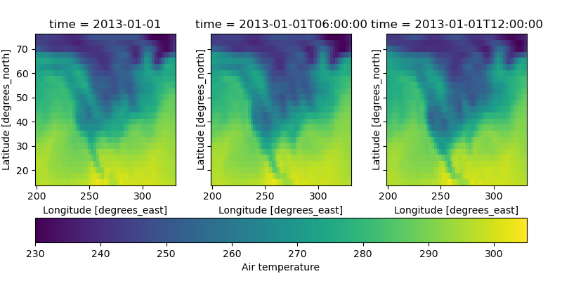
In [17]: fig, axes = plt.subplots(1, 3, figsize=(w, 4), sharey=True)

In [18]: for i, ax in enumerate(axes):
   ....:       c = ds.air.isel(time=i).plot.pcolormesh(
   ....:           ax=ax, add_colorbar=False, vmin=230, vmax=305)
   ....:

In [19]: fig.subplots_adjust(left=left, right=right, wspace=wspace)

In [20]: fig.colorbar(c, ax=axes.ravel().tolist(), orientation='horizontal',
   ....:     label='Air temperature');
   ....:
Fixing the colorbar thickness
Keeping the colorbar thickness constant introduces some additional challenges.
Since fig.colorbar locates it on the bottom of the plot, we’ll need to set
top and bottom pads for the figure, \(p_{top}\) and
\(p_{bottom}\), a pad between the
colorbar and the panels, \(p_{cbar}\), a thickness for the colorbar,
\(w_{cbar}\) and a height for the overall figure \(h\):
In [21]: p_top = 0.5

In [22]: p_bottom = 0.5

In [23]: p_cbar = 0.5

In [24]: w_cbar = 0.125

In [25]: h = 4.
The top and bottom pads need to be passed to
matplotlib.pyplot.subplots_adjust() and they
follow similar conventions to the left and right pads, i.e. they are defined in
terms of length relative to the overall height of the figure. The size of the
colorbar is controlled differently; we control its size when we construct it
using matplotlib.pyplot.colorbar(), using the fraction, pad,
and aspect arguments. fraction dictates the fraction of the height of
the colorbar would take with respect to the height of a single panel in the
original figure; pad dictates the fraction of a single panel in the
original figure the padding between the colorbar and panels would take; and
aspect sets the ratio of the width of the long part of the colorbar to its
thickness. Note that since we call matplotlib.pyplot.subplots_adjust()
before calling matplotlib.pyplot.colorbar(), the panel height in the
original figure is determined in part by our imposed \(p_{top}\) and
\(p_{bottom}\). In this case since we are only using a single row of
panels, we do not need to worry about the between panel spacing in this
dimension, but we’ll include the \(p_{internal}\) term to keep things
general:
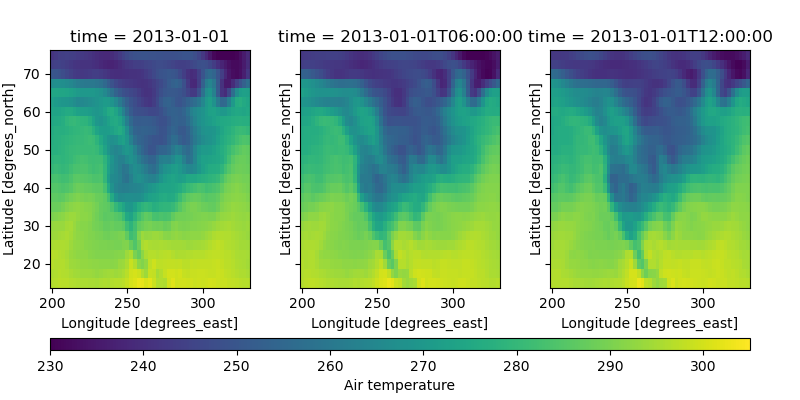
In [26]: h_panel_original = h - p_top - p_bottom

In [27]: fraction = w_cbar / h_panel_original

In [28]: pad = p_cbar / h_panel_original

In [29]: cbar_aspect = (w - p_left - p_right) / w_cbar

In [30]: top = (h - p_top) / h

In [31]: bottom = p_bottom / h
In [32]: fig, axes = plt.subplots(1, 3, figsize=(w, h), sharey=True)

In [33]: for i, ax in enumerate(axes):
   ....:       c = ds.air.isel(time=i).plot.pcolormesh(
   ....:           ax=ax, add_colorbar=False, vmin=230, vmax=305)
   ....:

In [34]: fig.subplots_adjust(left=left, right=right, wspace=wspace, top=top, bottom=bottom)

In [35]: fig.colorbar(c, ax=axes.ravel().tolist(), orientation='horizontal',
   ....:     label='Air temperature', fraction=fraction, pad=pad, aspect=cbar_aspect);
   ....:
Holding panels at a fixed aspect ratio
Things are starting to look much better, but there’s still more work to do.
Let’s introduce cartopy to the mix. Adding a cartopy
projection turns
out to fix the aspect ratio of the panels in the figure, regardless of the
figure size. We’ll want to address this additional constraint by adjusting our
value for the total height of the figure, because the panel height will now by
completely determined by the panel width. In a
cartopy.crs.PlateCarree projection, the
aspect ratio will be determined by the ratio of the latitudinal extent of the
map divided by the longitudinal extent. In this case it will be
\(\texttt{aspect} = \frac{75}{360}\). \(h_{panel}\) will now be
determined completely based on this aspect ratio and the panel width,
\(w_{panel}\) we determined earlier:
The total height, \(h\) is now just the sum of the height of the plot elements:
As a result of the height values changing, we’ll need to update the bottom and
top parameters for matplotlib.pyplot.subplots_adjust() as well as
the colorbar size parameters:
In [36]: a = 60. / 130.

In [37]: p_cbar = 0.25

In [38]: h_panel = a * w_panel

In [39]: h = p_bottom + p_top + h_panel + p_cbar + w_cbar

In [40]: h_panel_original = h - p_top - p_bottom

In [41]: fraction = w_cbar / h_panel_original

In [42]: pad = p_cbar / h_panel_original

In [43]: cbar_aspect = (w - p_left - p_right) / w_cbar

In [44]: top = (h - p_top) / h

In [45]: bottom = p_bottom / h
In [46]: import cartopy.crs as ccrs

In [47]: fig, axes = plt.subplots(1, 3, figsize=(w, h),
   ....:     subplot_kw={'projection': ccrs.PlateCarree()})
   ....:

In [48]: for i, ax in enumerate(axes):
   ....:       c = ds.air.isel(time=i).plot.pcolormesh(
   ....:           ax=ax, add_colorbar=False, vmin=230, vmax=305,
   ....:           transform=ccrs.PlateCarree())
   ....:       ax.coastlines()
   ....:       ax.set_extent([-160, -30, 15, 75], crs=ccrs.PlateCarree())
   ....:

In [49]: fig.subplots_adjust(left=left, right=right, wspace=wspace, top=top, bottom=bottom)

In [50]: fig.colorbar(c, ax=axes.ravel().tolist(), orientation='horizontal',
   ....:     label='Air temperature', fraction=fraction, pad=pad, aspect=cbar_aspect);
   ....:
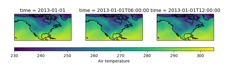
As examples go, this one was actually fairly simple; we only had one row of
panels, rather than multiple, and we only had one colorbar. Taking the
matplotlib.pyplot.subplots() approach was remarkably complicated.
What about AxesGrid?
In theory, it would be more straightforward to use the
mpl_toolkits.axes_grid1.AxesGrid framework to do this. Having said
that, it would still require a bit of math to determine the appropriate figure
height. In addition there are some other problems with that approach, e.g.
Using
mpl_toolkits.axes_grid1.AxesGridwith cartopy is not ideal due to axes sharing issues (SciTools/cartopy#939).Colorbars drawn using
mpl_toolkits.axes_grid1.AxesGridare drawn using an outdated colorbar class inmatplotlib, which is different than the one used by default (matplotlib/matplotlib#9778).
In faceted we use mpl_toolkits.axes_grid1.AxesGrid to aid
in the placing the axes and colorbars, but we do not use the axes generated by
it. Instead we create our own, which are modern and have working axes-sharing
capabilities. In so doing we create a
matplotlib.pyplot.subplots()-like interface, which is slightly more
intuitive to use than mpl_toolkits.axes_grid1.AxesGrid with or
without cartopy.
How would you do this in faceted?
In faceted this becomes much simpler; there is no need to do any algebra
or post-hoc adjustment of the axes placement; everything gets handled in the
top-level function.
In [51]: from faceted import faceted

In [52]: fig, axes, cax = faceted(1, 3, width=w, aspect=a,
   ....:                          left_pad=p_left, right_pad=p_right,
   ....:                          bottom_pad=p_bottom, top_pad=p_top,
   ....:                          internal_pad=p_internal,
   ....:                          cbar_mode='single', cbar_location='bottom',
   ....:                          cbar_size=w_cbar, cbar_pad=p_cbar, cbar_short_side_pad=0.,
   ....:                          axes_kwargs={'projection': ccrs.PlateCarree()})
   ....:

In [53]: for i, ax in enumerate(axes):
   ....:       c = ds.air.isel(time=i).plot.pcolormesh(
   ....:           ax=ax, add_colorbar=False, vmin=230, vmax=305,
   ....:           transform=ccrs.PlateCarree())
   ....:       ax.coastlines()
   ....:       ax.set_extent([-160, -30, 15, 75], crs=ccrs.PlateCarree())
   ....:

In [54]: plt.colorbar(c, cax=cax, orientation='horizontal',
   ....:               label='Air temperature');
   ....:

What can’t you do in faceted?
The main thing that faceted cannot do is create a
constrained set of axes
that have varying size, or varying properties. For more complex figure
construction tasks we recommend using a more fundamental matplotlib
approach, either using mpl_toolkits.axes_grid1.AxesGrid,
matplotlib.GridSpec, or Constrained Layout. The
main reason for creating faceted was that these other tools
were too flexible at the expense of simplicity. For a large percentage of
the use cases, they are not required, but for the remaining percentage they are
indeed quite useful.