Using faceted
faceted.faceted() is quite flexible. Here are a couple of examples
illustrating the different features. Using it in many ways resembles using
matplotlib.pyplot.subplots().
In [1]: import matplotlib.pyplot as plt
In [2]: import xarray as xr
In [3]: from matplotlib import ticker
In [4]: from faceted import faceted
In [5]: tick_locator = ticker.MaxNLocator(nbins=3)
In [6]: ds = xr.tutorial.load_dataset('rasm').isel(x=slice(30, 37), y=-1,
...: time=slice(0, 11))
...:
In [7]: temp = ds.Tair
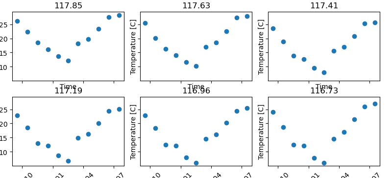
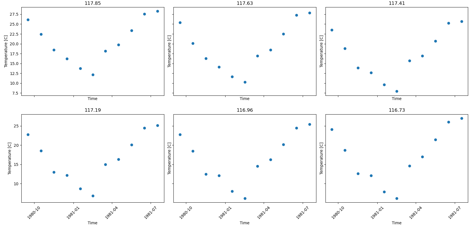
In [8]: fig, axes = faceted(2, 3, width=8, aspect=0.618)
In [9]: for i, ax in enumerate(axes):
...: temp.isel(x=i).plot(ax=ax, marker='o', ls='none')
...: ax.set_title('{:0.2f}'.format(temp.xc.isel(x=i).item()))
...: ax.set_xlabel('Time')
...: ax.set_ylabel('Temperature [C]')
...: ax.tick_params(axis='x', labelrotation=45)
...:
In [10]: fig.show()
Padding options
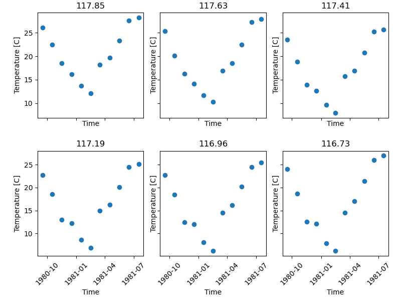
We’ll notice that there are some padding issues in the above plot. We can add
some padding using the outer and inner padding arguments. Specifying an
internal_pad as a tuple allows us to prescribe different horizontal and
vertical pad values; specifying a left_pad and bottom_pad allows us to
make room for the outer axes labels, while maintaining our prescribed figure
width.
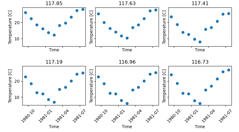
In [11]: fig, axes = faceted(2, 3, width=8, aspect=0.618, left_pad=0.75, bottom_pad=0.9,
   ....:                     internal_pad=(0.33, 0.66))
   ....:

In [12]: for i, ax in enumerate(axes):
   ....:     temp.isel(x=i).plot(ax=ax, marker='o', ls='none')
   ....:     ax.set_title('{:0.2f}'.format(temp.xc.isel(x=i).item()))
   ....:     ax.set_xlabel('Time')
   ....:     ax.set_ylabel('Temperature [C]')
   ....:     ax.tick_params(axis='x', labelrotation=45)
   ....:

In [13]: fig.show()
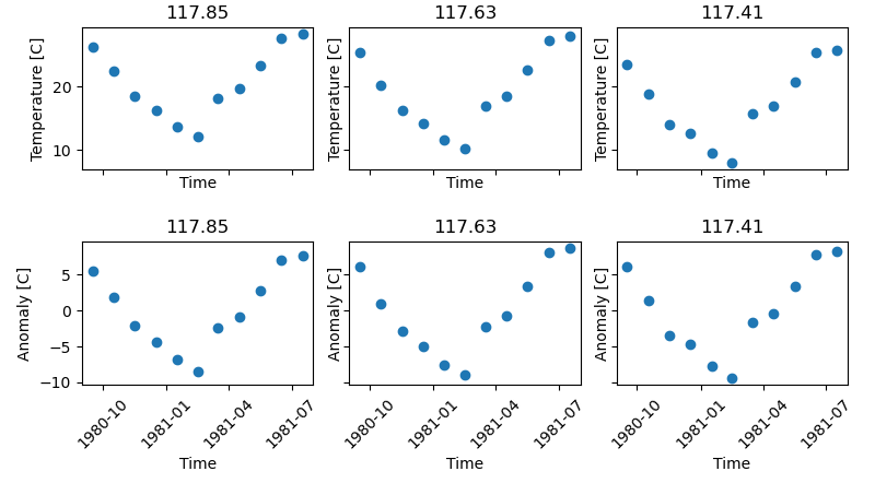
Sharing axes
By default all axes are shared among the panels. Let’s say we wanted to plot a different quantity on the bottom row of panels, so the y-axis would be different. Making use of the xarray tutorial dataset, we can plot an anomaly from the time mean at each location in the lower row instead.
In [14]: import numpy as np

In [15]: index = ds.indexes['time']

In [16]: time_weights = index.shift(1, 'MS') - index.shift(-1, 'MS')

In [17]: time_weights = xr.DataArray(time_weights, ds.time.coords)

In [18]: mean = (ds.Tair * time_weights).sum('time') / time_weights.where(np.isfinite(ds.Tair)).sum('time')

In [19]: anomaly = ds.Tair - mean

In [20]: fig, axes = faceted(2, 3, width=8, aspect=0.618, left_pad=0.75, bottom_pad=0.9,
   ....:                     internal_pad=(0.33, 0.66), sharey='row')
   ....:

In [21]: for i, ax in enumerate(axes[:3]):
   ....:     temp.isel(x=i).plot(ax=ax, marker='o', ls='none')
   ....:     ax.set_title('{:0.2f}'.format(temp.xc.isel(x=i).item()))
   ....:     ax.set_xlabel('Time')
   ....:     ax.set_ylabel('Temperature [C]')
   ....:

In [22]: for i, ax in enumerate(axes[3:]):
   ....:     anomaly.isel(x=i).plot(ax=ax, marker='o', ls='none')
   ....:     ax.set_title('{:0.2f}'.format(temp.xc.isel(x=i).item()))
   ....:     ax.set_xlabel('Time')
   ....:     ax.set_ylabel('Anomaly [C]')
   ....:     ax.tick_params(axis='x', labelrotation=45)
   ....:

In [23]: fig.show()
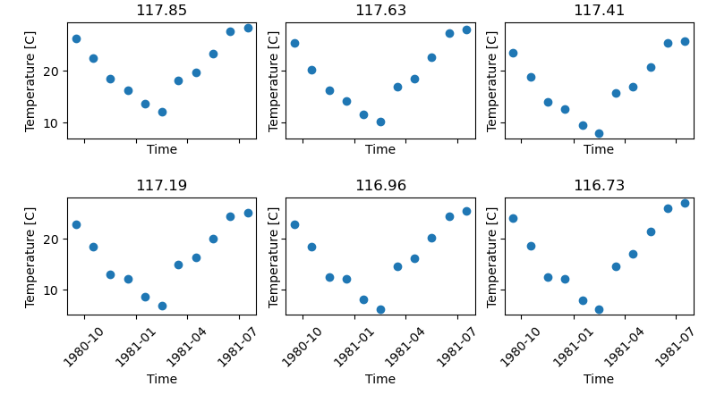
Types of constrained figures
faceted.faceted() supports multiple kinds of constrained figures. We simply need
to provide exactly two of the width, height, and aspect arguments and faceted.faceted()
does the rest.
Width-and-aspect constrained figure
This is what we’ve shown already, but for completeness we’ll repeat the example again here.
In [24]: import matplotlib.pyplot as plt

In [25]: import xarray as xr

In [26]: from matplotlib import ticker

In [27]: from faceted import faceted

In [28]: tick_locator = ticker.MaxNLocator(nbins=3)

In [29]: ds = xr.tutorial.load_dataset('rasm').isel(x=slice(30, 37), y=-1,
   ....:                                            time=slice(0, 11))
   ....:

In [30]: temp = ds.Tair

In [31]: fig, axes = faceted(2, 3, width=8, aspect=0.618, bottom_pad=0.9, left_pad=0.75,
   ....:                     internal_pad=(0.33, 0.66), sharey='row')
   ....:

In [32]: for i, ax in enumerate(axes):
   ....:     temp.isel(x=i).plot(ax=ax, marker='o', ls='none')
   ....:     ax.set_title('{:0.2f}'.format(temp.xc.isel(x=i).item()))
   ....:     ax.set_xlabel('Time')
   ....:     ax.set_ylabel('Temperature [C]')
   ....:     ax.tick_params(axis='x', labelrotation=45)
   ....:

In [33]: fig.show()
Height-and-aspect constrained figure
In [34]: import matplotlib.pyplot as plt

In [35]: import xarray as xr

In [36]: from matplotlib import ticker

In [37]: from faceted import faceted

In [38]: tick_locator = ticker.MaxNLocator(nbins=3)

In [39]: ds = xr.tutorial.load_dataset('rasm').isel(x=slice(30, 37), y=-1,
   ....:                                            time=slice(0, 11))
   ....:

In [40]: temp = ds.Tair

In [41]: fig, axes = faceted(2, 3, height=8., aspect=0.618, bottom_pad=0.9, left_pad=0.75,
   ....:                     internal_pad=(0.33, 0.66), sharey='row')
   ....:

In [42]: for i, ax in enumerate(axes):
   ....:     temp.isel(x=i).plot(ax=ax, marker='o', ls='none')
   ....:     ax.set_title('{:0.2f}'.format(temp.xc.isel(x=i).item()))
   ....:     ax.set_xlabel('Time')
   ....:     ax.set_ylabel('Temperature [C]')
   ....:     ax.tick_params(axis='x', labelrotation=45)
   ....:

In [43]: fig.show()
Width-and-height constrained figure
In [44]: import matplotlib.pyplot as plt

In [45]: import xarray as xr

In [46]: from matplotlib import ticker

In [47]: from faceted import faceted

In [48]: tick_locator = ticker.MaxNLocator(nbins=3)

In [49]: ds = xr.tutorial.load_dataset('rasm').isel(x=slice(30, 37), y=-1,
   ....:                                            time=slice(0, 11))
   ....:

In [50]: temp = ds.Tair

In [51]: fig, axes = faceted(2, 3, width=8, height=6., bottom_pad=0.9, left_pad=0.75,
   ....:                     internal_pad=(0.33, 0.66), sharey='row')
   ....:

In [52]: for i, ax in enumerate(axes):
   ....:     temp.isel(x=i).plot(ax=ax, marker='o', ls='none')
   ....:     ax.set_title('{:0.2f}'.format(temp.xc.isel(x=i).item()))
   ....:     ax.set_xlabel('Time')
   ....:     ax.set_ylabel('Temperature [C]')
   ....:     ax.tick_params(axis='x', labelrotation=45)
   ....:

In [53]: fig.show()
Colorbar modes and locations
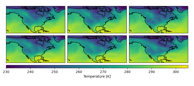
Let’s say we are plotting 2D data in the form of pcolormesh plots that require
a colorbar. faceted.faceted() comes with a number of options for placing and sizing
colorbars in a paneled figure. We can add a colorbar to a figure by modifying
the cbar_mode argument; by default it is set to None, meaning no
colorbar, as in the plots above. For all of the examples here, we’ll just plot
a time series of maps. Since the xarray tutorial data is geographic in nature,
we’ll also use this opportunity to show how to use cartopy with
faceted.faceted().
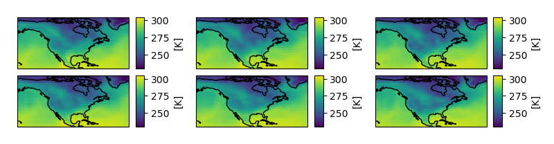
Single colorbar
A single colorbar is useful when we use the same color scale for all panels of a figure.
In [54]: import cartopy.crs as ccrs

In [55]: ds = xr.tutorial.load_dataset('air_temperature')

In [56]: aspect = 60. / 130.

In [57]: fig, axes, cax = faceted(2, 3, width=8, aspect=aspect,
   ....:                         bottom_pad=0.75, cbar_mode='single',
   ....:                         cbar_pad=0.1, internal_pad=0.1,
   ....:                         cbar_location='bottom', cbar_short_side_pad=0.,
   ....:                         axes_kwargs={'projection': ccrs.PlateCarree()})
   ....:

In [58]: for i, ax in enumerate(axes):
   ....:     c = ds.air.isel(time=i).plot(
   ....:         ax=ax, add_colorbar=False, transform=ccrs.PlateCarree(),
   ....:         vmin=230, vmax=305)
   ....:     ax.set_title('')
   ....:     ax.set_xlabel('')
   ....:     ax.set_ylabel('')
   ....:     ax.set_extent([-160, -30, 15, 75], crs=ccrs.PlateCarree())
   ....:     ax.coastlines()
   ....:

In [59]: plt.colorbar(c, cax=cax, orientation='horizontal', label='Temperature [K]');

In [60]: fig.show()
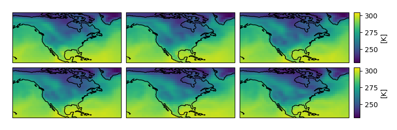
Edge colorbars
Edge colorbars are useful when rows or columns of a figure share a colorbar. We’ll show an example where the rows share a colorbar.
In [61]: aspect = 60. / 130.

In [62]: fig, axes, (cax1, cax2) = faceted(2, 3, width=8, aspect=aspect, right_pad=0.75,
   ....:                                   cbar_mode='edge',
   ....:                                   cbar_pad=0.1, internal_pad=0.1,
   ....:                                   cbar_location='right', cbar_short_side_pad=0.,
   ....:                                   axes_kwargs={'projection': ccrs.PlateCarree()})
   ....:

In [63]: for i, ax in enumerate(axes[:3]):
   ....:     c1 = ds.air.isel(time=i).plot(
   ....:         ax=ax, add_colorbar=False, transform=ccrs.PlateCarree(),
   ....:         vmin=230, vmax=305)
   ....:     ax.set_title('')
   ....:     ax.set_xlabel('')
   ....:     ax.set_ylabel('')
   ....:     ax.set_extent([-160, -30, 15, 75], crs=ccrs.PlateCarree())
   ....:     ax.coastlines()
   ....:

In [64]: plt.colorbar(c1, cax=cax1, label='[K]');

In [65]: for i, ax in enumerate(axes[3:], start=3):
   ....:     c2 = ds.air.isel(time=i).plot(
   ....:         ax=ax, add_colorbar=False, transform=ccrs.PlateCarree(),
   ....:         vmin=230, vmax=305)
   ....:     ax.set_title('')
   ....:     ax.set_xlabel('')
   ....:     ax.set_ylabel('')
   ....:     ax.set_extent([-160, -30, 15, 75], crs=ccrs.PlateCarree())
   ....:     ax.coastlines()
   ....:

In [66]: plt.colorbar(c2, cax=cax2, label='[K]');

In [67]: fig.show()
Colorbars for each panel
One more common use case is a colorbar for each panel. This can be done by
specifying cbar_mode='each' as an argument in the call to faceted.faceted().
In [68]: tick_locator = ticker.MaxNLocator(nbins=3)

In [69]: aspect = 60. / 130.

In [70]: fig, axes, caxes = faceted(2, 3, width=8, aspect=aspect, right_pad=0.75,
   ....:                            cbar_mode='each',
   ....:                            cbar_pad=0.1, internal_pad=(0.75, 0.1),
   ....:                            cbar_location='right', cbar_short_side_pad=0.,
   ....:                            axes_kwargs={'projection': ccrs.PlateCarree()})
   ....:

In [71]: for i, (ax, cax) in enumerate(zip(axes, caxes)):
   ....:     c = ds.air.isel(time=i).plot(
   ....:         ax=ax, add_colorbar=False, transform=ccrs.PlateCarree(),
   ....:         cmap='viridis', vmin=230, vmax=305)
   ....:     ax.set_title('')
   ....:     ax.set_xlabel('')
   ....:     ax.set_ylabel('')
   ....:     ax.set_extent([-160, -30, 15, 75], crs=ccrs.PlateCarree())
   ....:     ax.coastlines()
   ....:     cb = plt.colorbar(c, cax=cax, label='[K]')
   ....:     cb.locator = tick_locator
   ....:     cb.update_ticks()
   ....:

In [72]: fig.show()
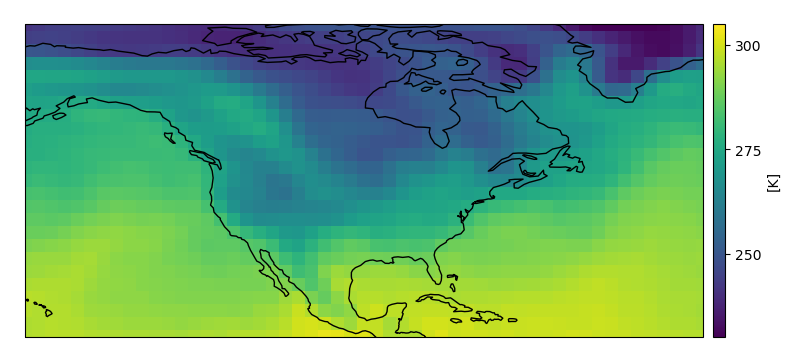
Creating a single-axis figure
For convenience, faceted comes with a function built specifically for creating
single-axis figures called faceted.faceted_ax(). It takes alls the same keyword
arguments as faceted.faceted() but returns scalar Axes objects.
In [73]: from faceted import faceted_ax

In [74]: tick_locator = ticker.MaxNLocator(nbins=3)

In [75]: aspect = 60. / 130.

In [76]: fig, ax, cax = faceted_ax(width=8, aspect=aspect, right_pad=0.75,
   ....:                           cbar_mode='each',
   ....:                           cbar_pad=0.1, internal_pad=(0.75, 0.1),
   ....:                           cbar_location='right', cbar_short_side_pad=0.,
   ....:                           axes_kwargs={'projection': ccrs.PlateCarree()})
   ....:

In [77]: c = ds.air.isel(time=0).plot(
   ....:     ax=ax, add_colorbar=False, transform=ccrs.PlateCarree(),
   ....:     cmap='viridis', vmin=230, vmax=305)
   ....:

In [78]: ax.set_title('')
Out[78]: Text(0.5, 1.0, '')

In [79]: ax.set_xlabel('')
Out[79]: Text(0.5, 0, '')

In [80]: ax.set_ylabel('')
Out[80]: Text(0, 0.5, '')

In [81]: ax.set_extent([-160, -30, 15, 75], crs=ccrs.PlateCarree())

In [82]: ax.coastlines()
Out[82]: <cartopy.mpl.feature_artist.FeatureArtist at 0x7e323f59cf50>

In [83]: cb = plt.colorbar(c, cax=cax, label='[K]')

In [84]: cb.locator = tick_locator

In [85]: cb.update_ticks()

In [86]: fig.show()
Parameter defintions
A full summary of the meanings of the different arguments to faceted.faceted() can be
found here.
Parameters controlling figure and axes dimensions
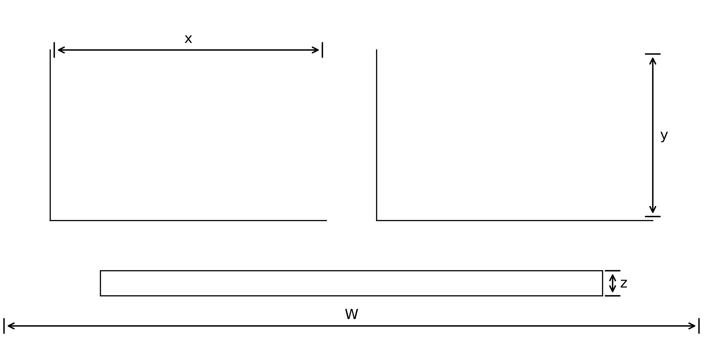
W:
widthcontrols the overall width of the figure in inches.y / x:
aspectcontrols the aspect ratio of the panels.z:
cbar_sizecontrols the thickness of the colorbar in inches.
Parameters controlling padding
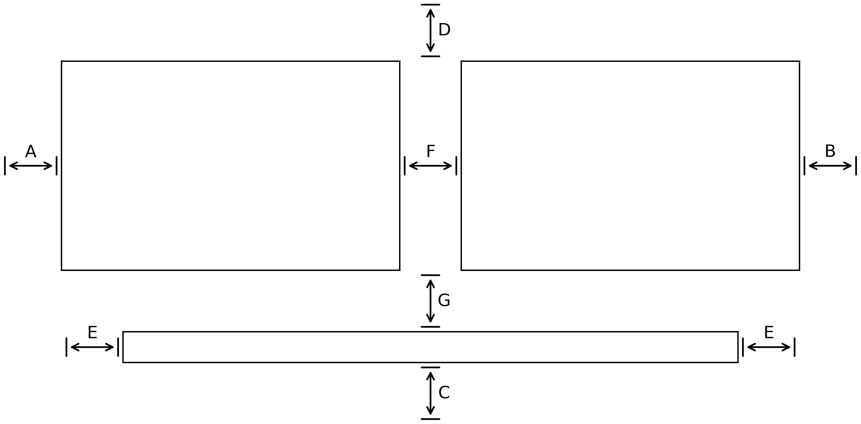
A:
left_padcontrols the spacing between the left-most axes and the edge of the figure in inches.B:
right_padcontrols the spacing between the right-most axes and the edge of the figure in inches.C:
bottom_padcontrols the spacing between the bottom-most axes and the edge of the figure in inches.D:
top_padcontrols the spacing between the top-most axes and the edge of the figure in inches.E:
cbar_short_side_padcontrols the spacing between the edges of the colorbar and the edges of the axes in inches.F:
internal_padcontrols the spacing between the non-colorbar axes in inches. It can either be a number (and specify the horizontal and vertical pad at the same time) or it can be a length-two sequence (and specify both the horizontal and vertical pads, respectively).G:
cbar_padcontrols the spacing (in inches) between the edge of the non-colorbar axes and the colorbar axes.